Transform Your Digital Marketing Strategy Digital Strategies That Convert
The top digital marketing agency for home services, home improvement, and healthcare industries.
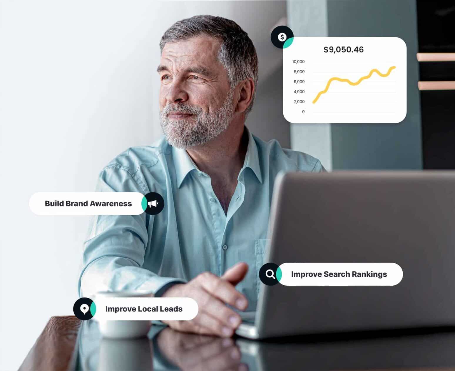
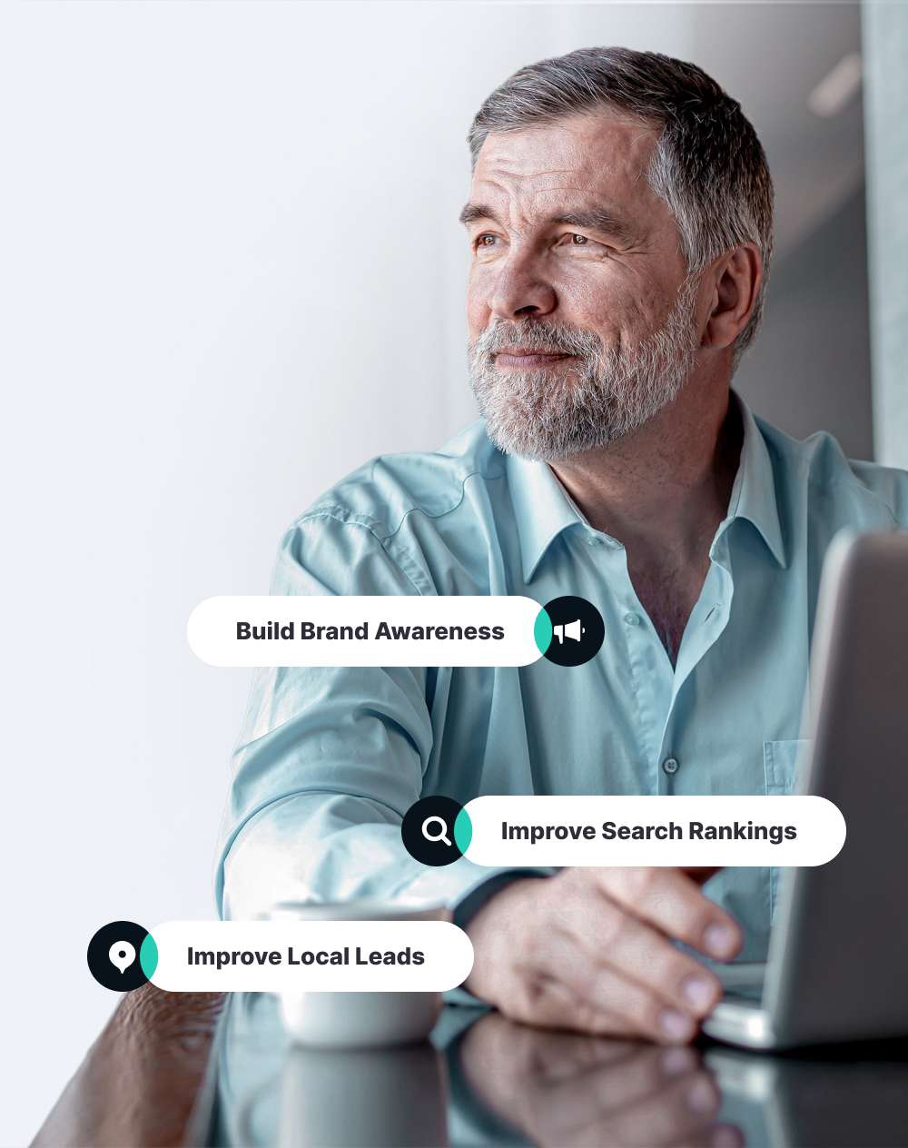
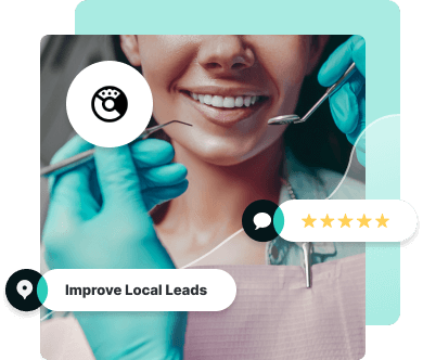
Need to expand your reach? We’ve got you covered.
It’s not rocket science — if you want to grow your business, you need to reach a wider audience and get more leads. Our team of digital marketing experts specializes in crafting multi-channel strategies to do just that. But we're not a typical service provider: We're here to be an extension of your team.
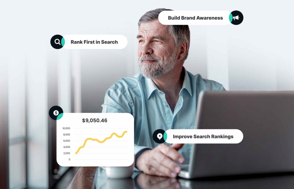
Our digital marketing agency offers a holistic range of strategies to bring in new customers, but always focuses on finding ways to connect you with ready-to-act, qualified potential customers. We'll show you exactly how the magic happens with our dashboard, and help you identify the strategies and niches that are helping you grow your customer base the fastest so that you can make the most of the digital marketing services we have to offer. Ready to level up your business growth?
INDUSTRY EXPERTS
We employ some of the best talent in the digital marketing industry, specializing in elevating the online presence of your home services business, home improvement contractor marketing, or healthcare company.
Better Reporting
In digital marketing, transparent reporting is key. We arm our clients with custom reports and the marketing data needed to make business decisions.

GROWTH PARTNER
We’ll help you grow — and scale your marketing as you do. Our team has the experience needed to catapult your business to success, whether it's a new home service company or a longtime healthcare firm.
Who We Help


SOLUTIONS & SERVICES
How We Help
Optimized Websites
Our award-winning design team works alongside our in-house web development team to build optimized websites designed to convert customers.
SEO
The internet is competitive, but our SEO strategy team knows what it takes to get your website to rank for terms that customers are using to search.
Paid Media
Our experts leverage cutting-edge algorithms and targeting, and creative to get your brand in front of consumers at the right time driving more high-quality leads.
Content
Our in-house content team specializes in writing unique, optimized web content as well as copywriting for other digital channels, such as email and social media.
Digital Strategies
As your partner, Socius will work to understand your business’ needs and KPIs in order to implement powerful strategies that align with your goals.
Social Media
We specialize in developing creative, powerful campaigns for both paid and organic social media that will drive engagement across your social channels.
Review Management
Turn feedback into growth; our reputation monitoring platform helps you harness the power of reviews, fostering trust and building stronger customer relationships.
A Digital Marketing Agency That Understands Your Business
We’ve seen it a thousand times — a business owner or marketing manager in the home services or healthcare sector comes to us, unsure about whether digital marketing is right for their specific needs. If your business has wasted money in the past on ineffective marketing efforts or the agency you worked with just didn’t understand your business, you may feel like there isn’t a digital solution for you and your business.
At Socius, we do things differently. We work with you to collaboratively develop strategies that make sense for your unique market and are designed to reach your business’s goals. Here’s why working with Socius will be better:
INDUSTRY EXPERTS IN DIGITAL MARKETING STRATEGY
We are trusted marketing experts in the home services marketing, home improvement, and healthcare spaces. Industry leaders work with us to build custom marketing strategies that work.
We have team members specializing in search engine optimization, social media marketing, content marketing, and every other service you can expect from a top tier holistic digital marketing agency. We aim to build long term relationships with our customers, shifting our digital marketing strategy as they grow and their needs change.
MORE LEADS, BETTER REPORTING
Our core focus is quality lead generation, especially in the niches of home improvement, healthcare, and home services marketing. With our transparent reporting, you’ll understand the effectiveness of your campaigns and where to focus your marketing efforts to maximize reach.
Our approach emphasizes lead quality over lead quantity. We aim to pull highly relevant, valuable potential customers that are more likely to convert than the low quality results you might find in other lead generation agencies.
We'll work with you to help you understand your dashboard and its analytics. You'll have the ability to see at a glance what's working the best, so that you can know where to continue focusing your campaign efforts and get help from us if you need guidance targeting a particular niche.
YOUR PARTNER FOR MARKETING GROWTH
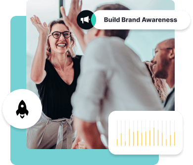
At Socius, we understand that as your business expands, your marketing objectives shift. Initially, your focus may be on building brand awareness. However, as you grow, the emphasis naturally transitions to acquiring new customers and retaining the ones you already have.
Our digital marketing agency is designed to evolve alongside you through scalable marketing. We'll preventing any plateau in your marketing before it happens, so you're always ahead of the curve.


Reborn Home Solutions
"Have a conversation and lay out what you’re looking for. Then allow Socius to provide you with insights into what you can do to meet your goals because everyone’s goals are different. They have a very experienced team, especially within our space."
NEWPRO Home Solutions
"We wanted as much market share as we could gain in our territory. We also wanted to do so in a cost-efficient manner and in a format we could control easily."

American Home Design
"Socius Marketing has taken our website to a whole new level. They understand the home improvement industry and what it takes to generate a lead. We've enjoyed partnering with them for many years and definitely recommend them."

Dave Yoho
"If you are looking to get involved with a first-class organization that knows the industry inside and out, we highly recommend Socius."

American Association of Physician Specialists, Inc.
"Socius Marketing has helped the American Board of Physician Specialties increase its brand awareness through SEO. The staff is knowledgable and takes a professional approach in everything they do. "

Faerber's Bee Window, Inc.
"The proof is in the numbers. Looking back at where we were in 2019, before the new website and Socius, it wasn’t where we wanted to be. It may have looked like we were doing well, but you never know the type of numbers you can get if you just go for it."
Coastline Orthodontics
"First and foremost, our new patient numbers have skyrocketed over the years."

Culp Dental
"I like to see what’s happening with our marketing efforts. If I’m putting money into something I want to see my investment, and that’s what I get."
GatorGuard
"I’m not interested in understanding things at the level Socius understands these things. I’m interested in a partner I can trust so I can focus on our growth. I have blind faith in my team. That means I can do what I need to do, knowing I have somebody there."
First Coast Siding
"I’m a believer in not putting all your eggs in one basket, but I also believe that if you find a company that you really enjoy working with, stick with it. And that’s what I did."